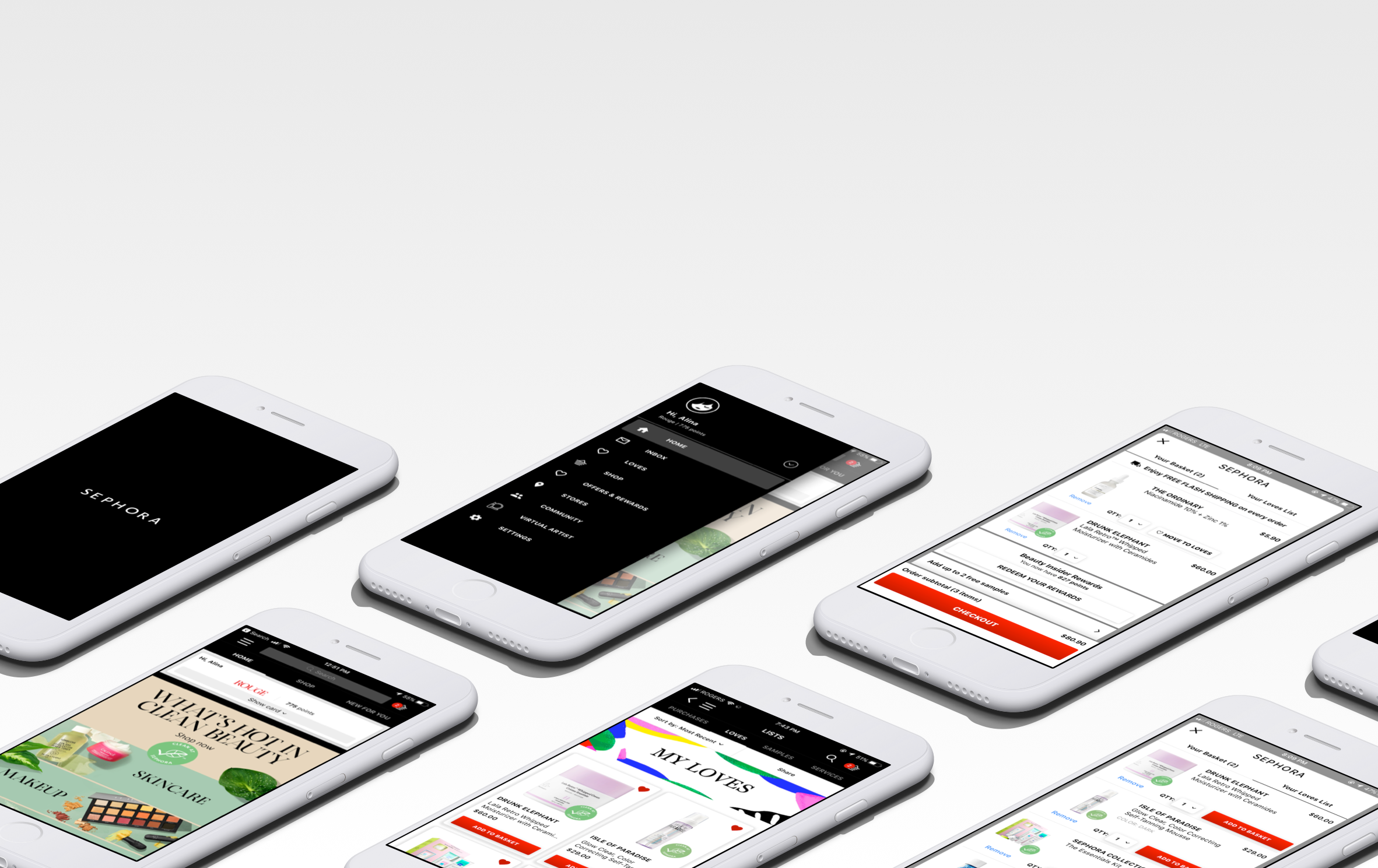

Sephora is a global chain of cosmetic stores that carries over 300 brands. Additionally to the in-store experience, Sephora offers web and mobile shopping platforms to extend their services online to their clients.
With increasing popularity of beauty influencers and online shopping, I found myself browsing Sephora app to find products that would suit my skin concerns. Having used the app for a while, I have had trouble navigating to certain parts of the app and an overall confusion with some of the functionality.
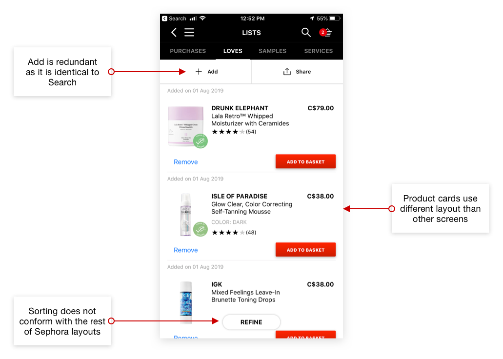
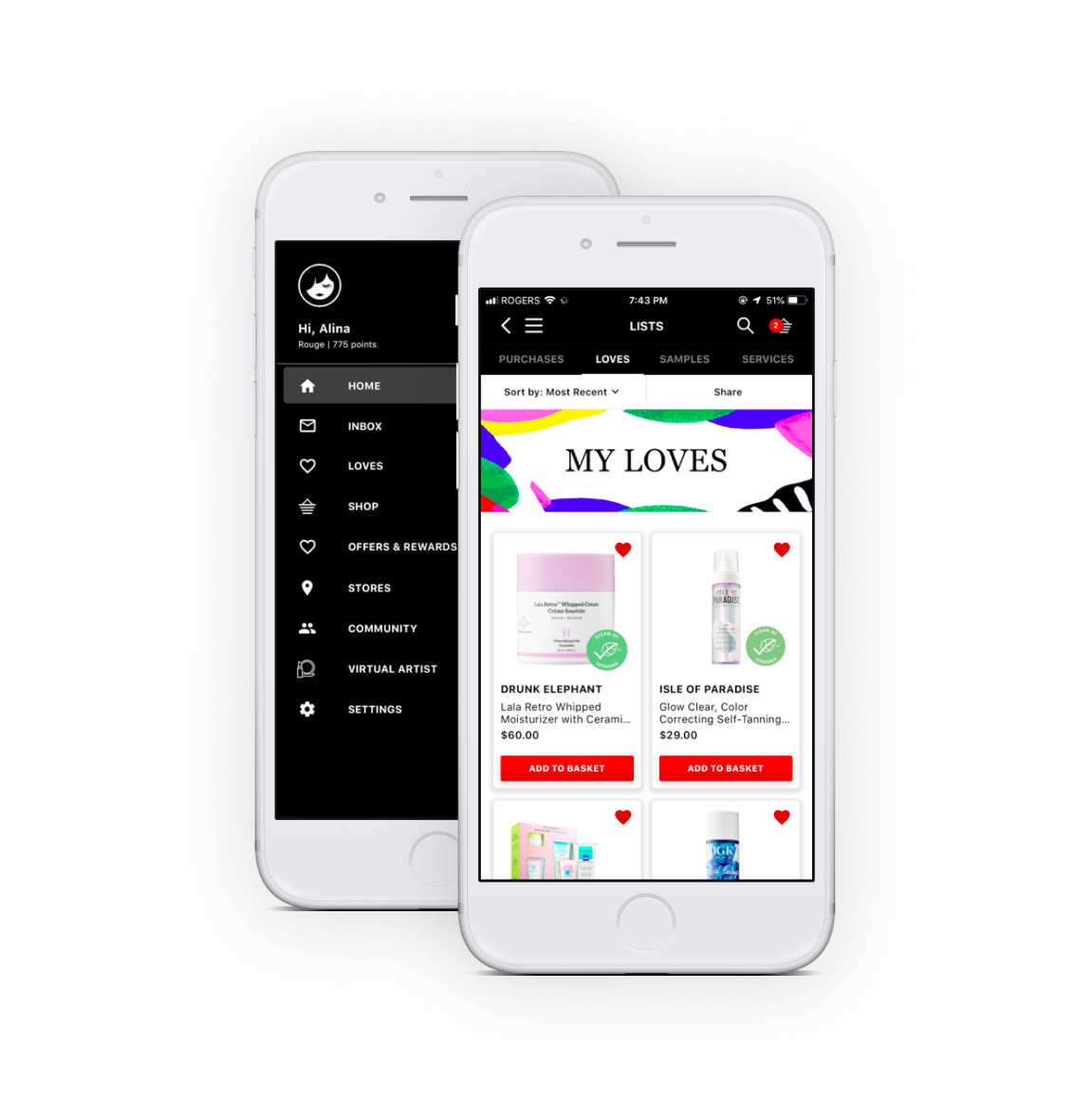
After examining the interface of Sephora Mobile App more carefully, I identified an area for improvement that I could work on in this design challenge. I decided to focus on the Loves List feature and chose to redesign the experience for this part of the app. I identified the following problems to work on in this design challenge.
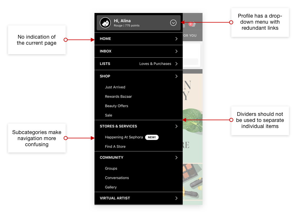
- Access to the Loves List is not intuitive since it is hidden beneath the layers of information.
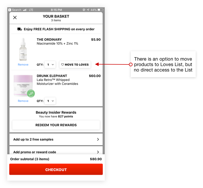
- No direct access to Loves List from the basket.
To define a useful solution, I examined the user interaction flow when using the Loves List feature in Sephora app. The user flow can be divided into two parts: adding products to Loves List and accessing Loves List.
- Love products
- Loves List feature is Sephora’s take on wishlists. When users “love” products, they get saved in the Loves List. Later, users can add these products to basket from their Loves List.
- access loves list
- Accessing Loves List is done either through the navigation drawer menu or through the New For You tab on the Home page. Sephora does not use a bottom navigation bar, instead, tabs are used for high level navigation on certain pages. Due to this structure, the main access to the Loves List currently resides in the navigation drawer.
