Platform for protestors to keep each other safe and informed
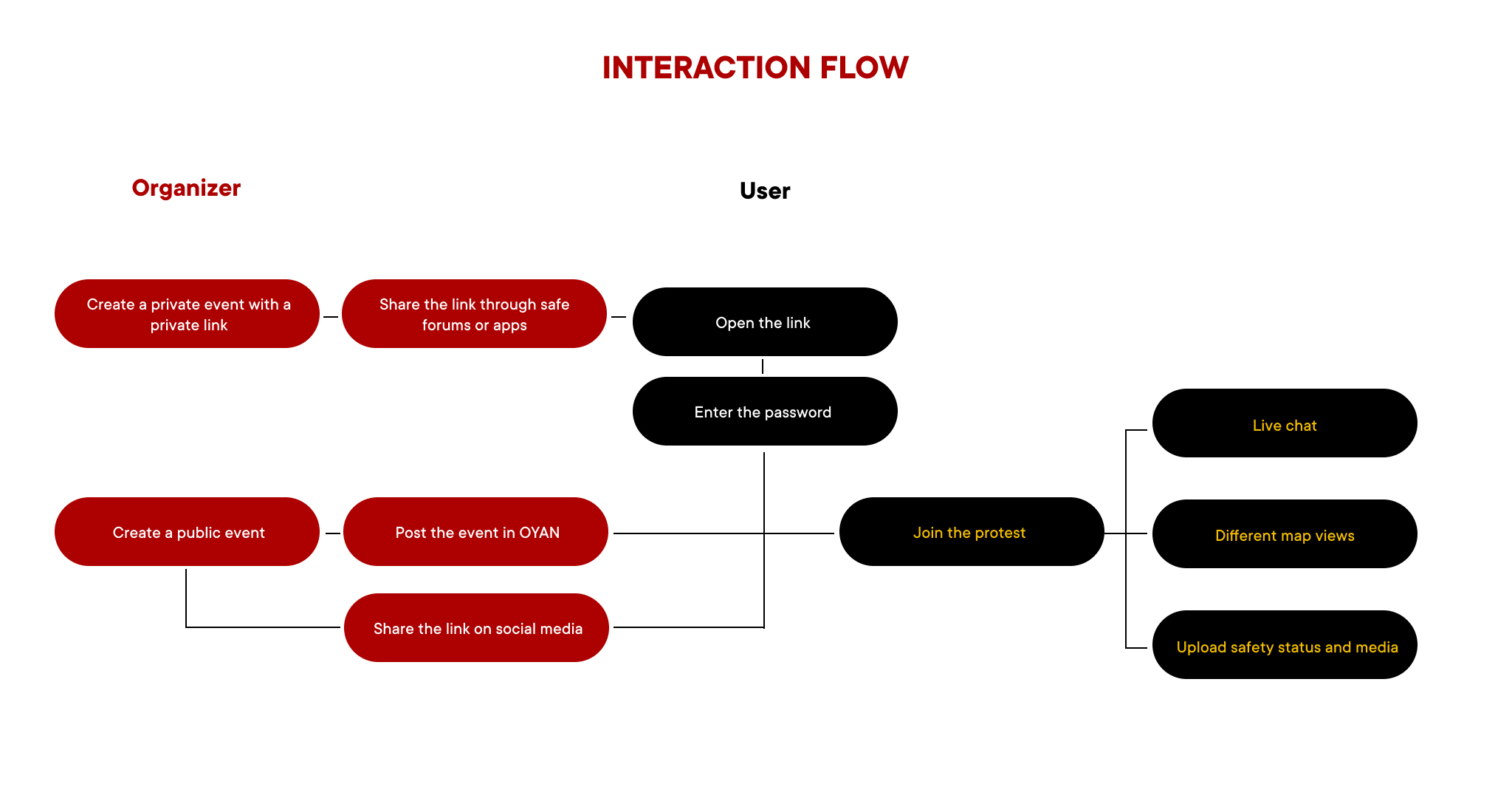
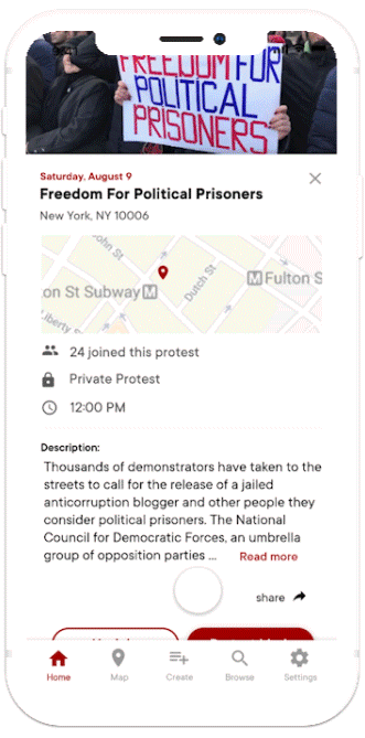
OYAN is a platform that supports protesters by helping them coordinate the demonstrations using GPS and Bluetooth technology. It provides users with an interactive map that displays area safety status, ongoing protest-related media, and a live chat for protest participants that runs without the Internet.
The series of protests that broke out in Kazakhstan at the beginning of this summer was tagged as #oyan protests. "Oyan" from Kazakh means 'To wake up'. By using this tag, the political activists and other demonstration participants agitated the citizens to finally start taking actions towards making a political statement, rather than hide or stay quiet about the issues.

This project has been developed in a small design team. We conducted domain research, explored various solutions, designed wireframes and mockups, prototyped the solution, evaluated our interactive system through user testing, and refined the application according to the feedback.

Protests play an important part in the civil, political, economic, social and cultural life of all societies. They inspire positive social change and the advancement of human rights in all parts of the world.
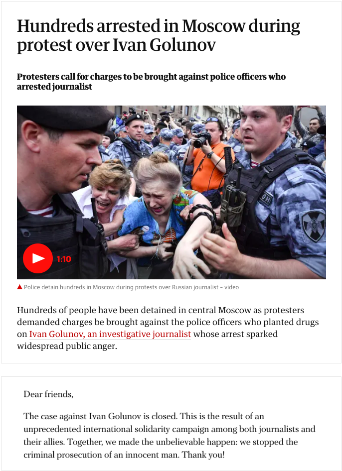
For instance, in 2019, Ivan Golunov, a Russian investigative journalist, was arrested based on drug-dealing charges. However, the charges turned out to be fabricated as they were an attempt to halt his widely reported articles on Russian government corruption. The only reason why the charges were eventually dropped and Golunov was released is due to an international solidarity/protest campaign that blew up both online and on the streets.
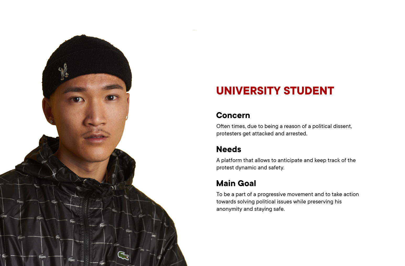
To define the application persona along with the journey map, we conducted several interviews with the people that come from Kazakhstan and Hong Kong. At the current moment (early 2019), these two countries are experiencing a lot of political changes, which became a reason for mass protest outbreaks and arrests.
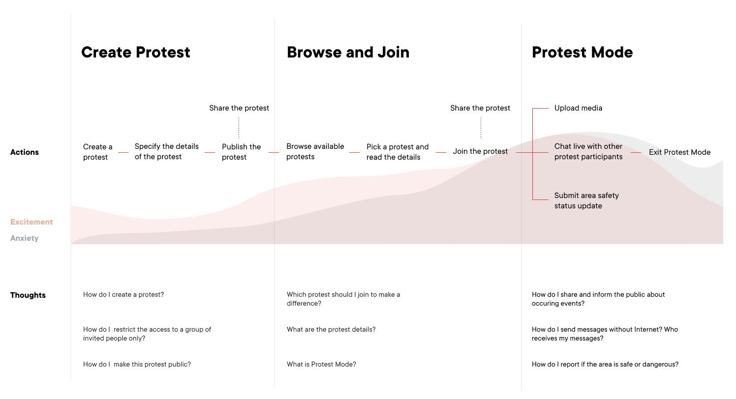
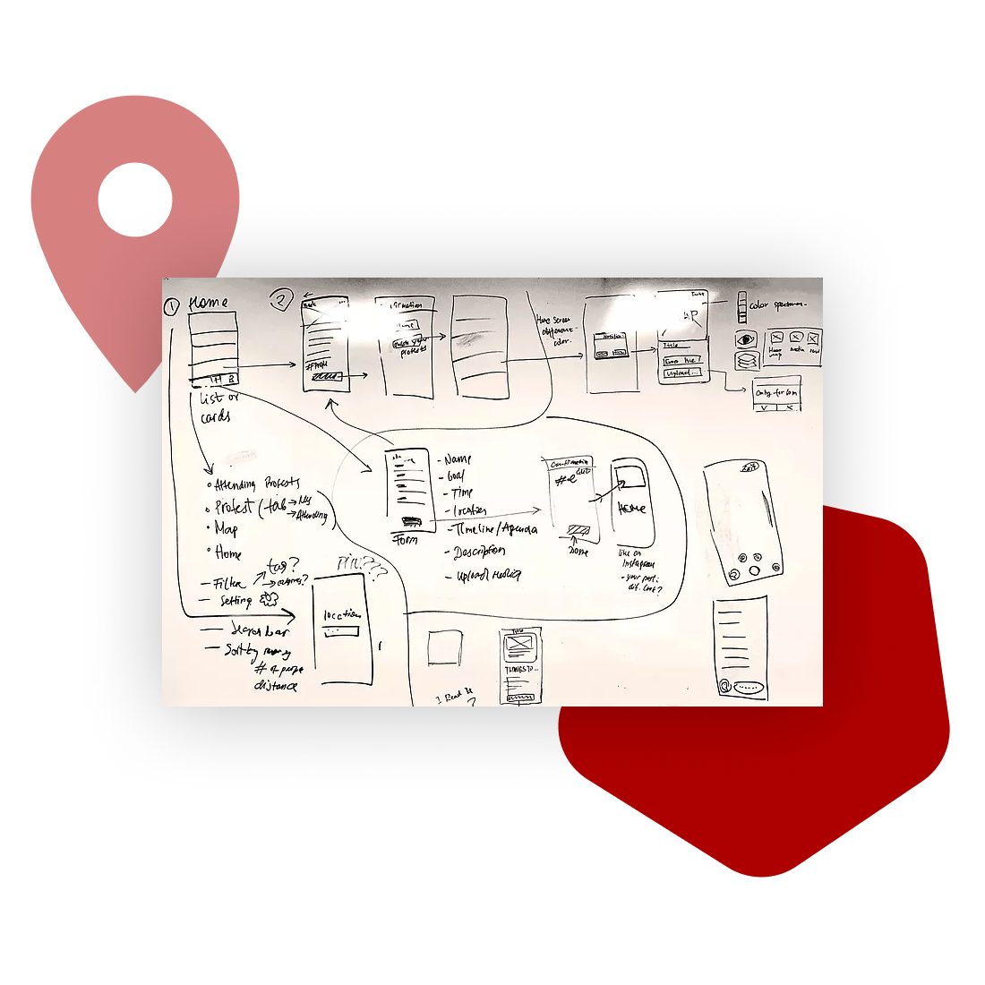
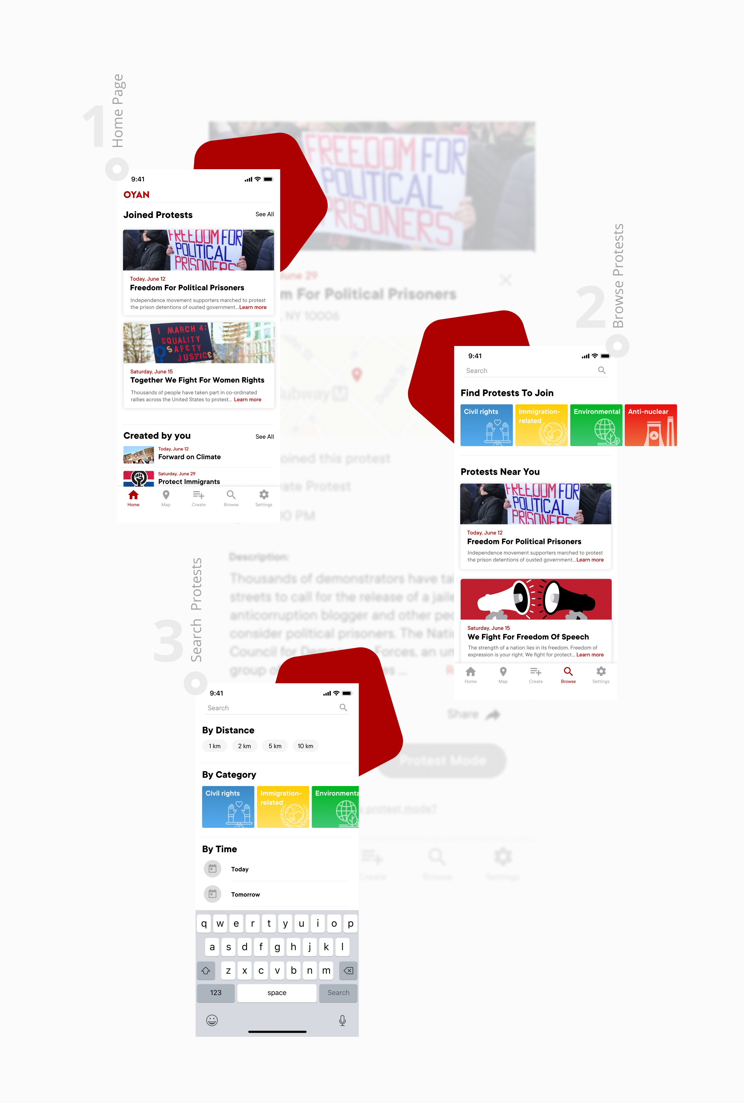
To finalize the application workflow and design, our team went through numerous iterations. At first, to understand and evaluate planned functionalities, we created preliminary sketches and grey box wireframes. Then, we started refining our visual direction and creating interactive prototypes of the interface workflows for further testing.

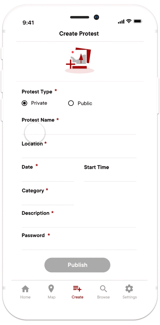


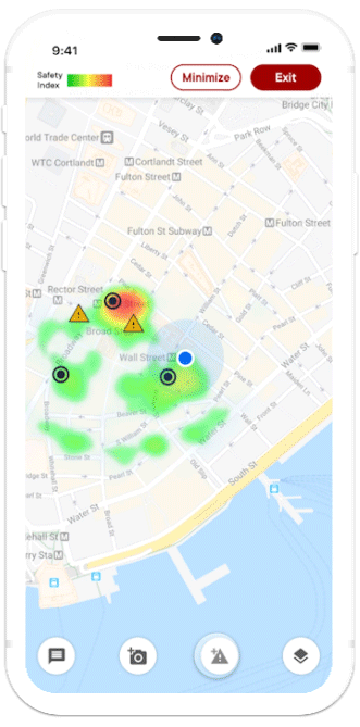

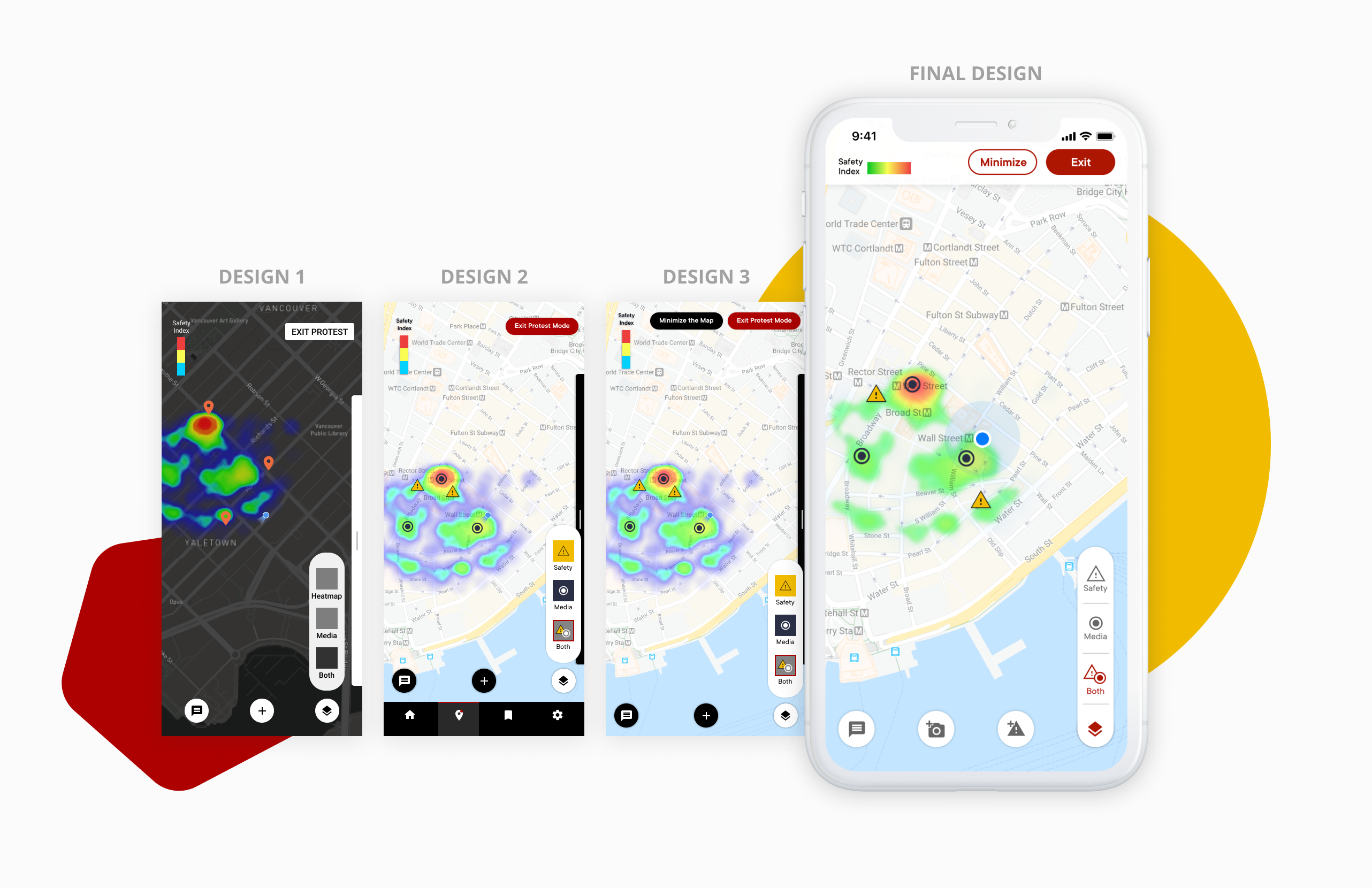
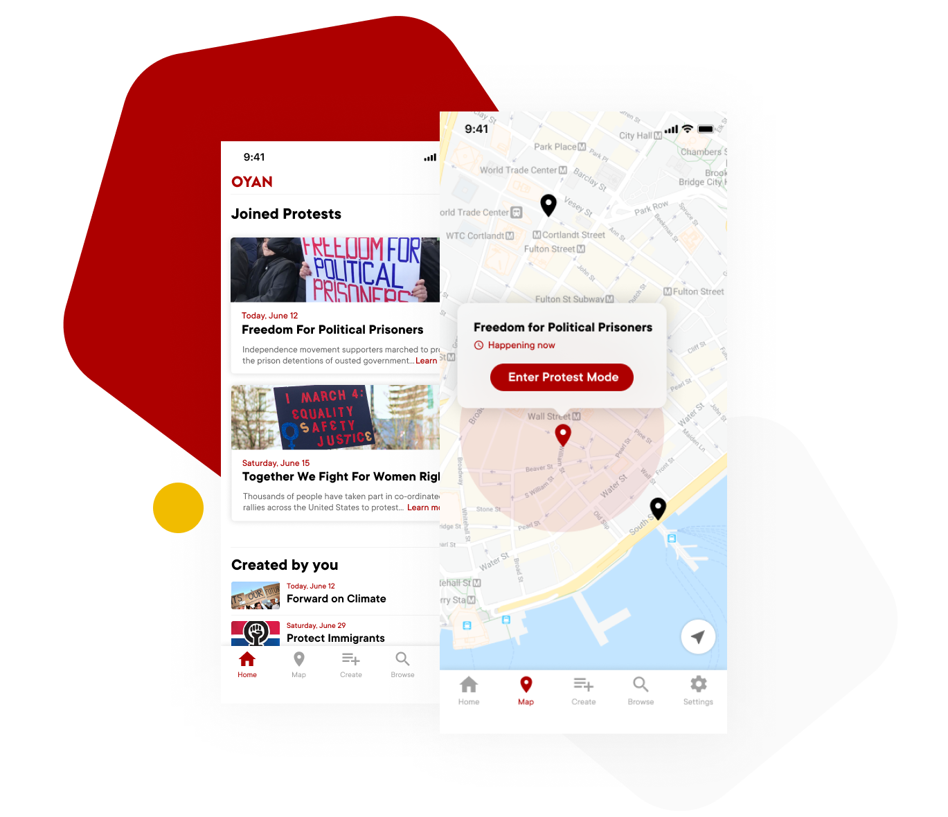
One of the key application features is the interactive map in the protest mode because it has a high frequency of use and it provides important information about area safety during the protest. For this feature, users will use the interactive map to view safety status and current media uploads. Therefore, information architecture and graphic design of the app are of the most importance.
design 1
As the interactive map communicates various types of information to the users, such as safety status and media uploads, the screen could get unnecessary crowded. We wanted to give users freedom to view the data that is most relevant to them at any given time. In order to tackle this issue, we adopted the map layers approach that is widely used by most of the maps applications. The users can switch between the safety heatmap, media uploads or view both at the same time.
design 2 and 3
The original design of the interactive map was in a dark mode, with red location icons representing media uploads. However, after careful revision, my team and I made some changes to the approach. We realized that the dark mode would not be comfortable to use during the day due to the low contrast between the map elements. We also introduced a new warning icon to represent safety status alerts. Thus, we changed the location icons to circles for the media uploads in order to better differentiate the icons. While in both design 2 and 3, we used the same methods to communicate map data, the main navigation bar is only present in design 2.
final design
After testing the application with target users, we used the insights to improve the functionality of the map. All of the test participants stated that the blue colour in the safety index was confusing. The suggested improvement was to use the traditional colour palette that uses green to indicate the safest status. We also changed the appearance of the map layers dialog to match the overall style of the application.